
The Normal Curve
is Everything "Normal?" The Power of the Bell Curve

Imagine you’re standing in a crowded terminal. Look around. Most people are roughly the same height. A few tower over the crowd; a few others are tucked away below eye level. It feels random, right? Just a chaotic mix of genetics and nutrition.
But here’s the kicker: if you measured every person in that room and plotted them on a graph, you’d see a ghost appear. A perfectly symmetrical, elegant curve.
This isn’t just about height. This same ghost shows up in the manufacturing tolerances of a NASA lens, the fill weight of bottles rolling off an assembly line, machine part dimensions, and exam scores.
19th-century scientists were so stunned by this regularity that they thought they’d discovered the secret blueprint of the universe. The Belgian statistician Adolphe Quetelet was among the first to notice it appearing everywhere in human data — from chest measurements of Scottish soldiers to crime rates across French provinces — and became convinced it reflected a divine order underlying nature.
It’s called the Normal Curve, and it’s one of the most powerful tools in probability theory, statistics, and engineering.
The Gambler’s Ghost
Most people think statistics started in a boring lab. It actually started in a gambling den.
In the early 1700s, Abraham de Moivre was not a celebrated mathematician. He was a French Huguenot refugee, forced out of France after Louis XIV revoked the Edict of Nantes in 1685, stripping Protestants of their rights. He arrived in London with a brilliant mind and almost nothing else. To survive, he haunted the coffee houses of London — particularly Slaughter’s Coffee House in St. Martin’s Lane — where gamblers, merchants, and speculators gathered to argue odds and place bets. De Moivre made his living as a consultant. Men with money and games would come to him with problems. It was unglamorous work for one of the sharpest mathematical minds in Europe. Isaac Newton himself reportedly said, when people came to him with questions about mathematics: “Go to Mr. de Moivre. He knows these things better than I do.”
The problems gamblers brought him were mostly about coins and dice. Simple questions with messy answers. If you flip a coin ten times, how likely are you to get exactly six heads? What about a hundred flips? A thousand? These weren’t just academic puzzles — men were wagering real money on the answers, and they needed precision.
So de Moivre started calculating. And the more he calculated, the more he noticed something unsettling.
When you flip a coin just a few times, the results feel chaotic. You might get all heads. You might get all tails. Anything seems possible. But as the number of flips grew — into the hundreds, then the thousands — the chaos started to organize itself. The outcomes didn’t scatter randomly across the page. They compressed. They converged. Heads and tails balanced out toward fifty-fifty, and the results clustered around that midpoint in a very specific, almost architectural way.
De Moivre began calculating the probability of each possible outcome and plotting them. What he found stopped him cold. The shape that emerged wasn’t jagged or irregular. It was smooth. Symmetrical. A perfect hill, steep in the center where the most likely outcomes lived, tapering off at the edges where the rare results dwelled. No matter how he adjusted the problem — more flips, different coins, different odds — the same shape kept asserting itself.
In 1733, he captured this mathematically in a privately circulated paper, deriving for the first time the equation that described this curve. He had found something real. Something that seemed to exist beneath the surface of randomness itself. He called it an approximation, a tool for simplifying complex calculations — he was too modest, or perhaps too practical, to claim he’d discovered something profound.
But he had.
What de Moivre had stumbled onto, in the back rooms of a London coffee house while solving bets for gamblers, was the normal distribution. The insight was this: random events, when repeated enough times, don’t stay random-looking. They organize. They pile up in the middle and thin out at the extremes. Probability, it turns out, has a shape. And that shape is always the same.
He couldn’t have known that a century later, scientists would find that same shape in the heights of soldiers, the errors of astronomers, the motion of molecules, and the daily fluctuations of financial markets. He was just trying to help gamblers win.
But the curve he found in those coin flips would go on to become one of the most consequential mathematical discoveries in human history.
What the Normal Curve Actually Is
The normal curve — also called the Gaussian distribution or bell curve — is a specific mathematical shape. The formula contains three of the most famous numbers in mathematics: √2, π, and e. Their appearance is more a matter of mathematical elegance than practical necessity — in practice, you never need to touch the formula at all.

What you do need to know are its key properties:
Symmetric about the average. The left and right halves are mirror images.
Total area = 100%. The curve represents all possible values.
The tails never touch zero. They extend infinitely, becoming vanishingly small — only about 6 out of every 100,000 observations fall outside the range from −4 to +4 standard deviations.
Most values cluster near the center, with fewer and fewer appearing as you move toward the extremes.
Why “Normal” Is a Misleading Name
The name has caused decades of confusion. It does not mean that data should look like this, or that other distributions are somehow abnormal.
The word comes from an 18th-century idea of a natural rule — scientists observed that measurement errors and human traits clustered symmetrically around an average, and believed this curve described how nature normally behaves.
We now know that is not universally true. Many common, important distributions are not bell-shaped:
Income is strongly right-skewed — a small number of very high earners stretch the tail far to the right.
Stock market returns have heavy tails — extreme crashes and gains occur far more often than a normal curve predicts.
City populations follow a power-law, with thousands of small towns and a handful of megacities.
Human body weight is also right-skewed.
Mistaking these for normal distributions doesn’t just produce inaccurate estimates — it can produce dangerously wrong ones. In finance, underestimating tail risk has contributed to real crises.
The Three Numbers You Need to Know
For any data set that does follow the normal curve, three areas under the curve are worth memorizing:
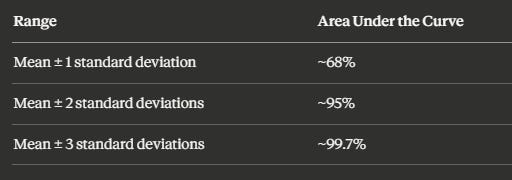
These aren’t arbitrary. They come directly from the geometry of the curve — and they are the backbone of everything from quality control to clinical trials.
Standard Units: The Key That Unlocks the Curve
To use the normal curve on real data, you first need to convert your values into standard units (also called z-scores or sigma-scores).
The formula is simple: subtract the average, then divide by the standard deviation.
z = (value − average) / standard deviation
A z-score tells you how many standard deviations a value sits above or below the mean. Values above average get a positive sign; values below get a negative sign.
Worked example: Suppose women’s heights in a sample average 162 cm with a standard deviation of 6 cm. A woman who is 174 cm tall is 12 cm above average. Since 12 cm = 2 SDs, her z-score is +2.
Once you’ve converted to standard units, you can look up any area under the curve using a normal distribution table — or use a built-in function in Excel or Google Sheets (NORM.S.DIST).
When the Normal Curve Fails: Percentiles Step In
The normal approximation only works when your data actually follow the normal curve. When they don’t — particularly with skewed distributions — the mean and standard deviation become unreliable summaries.
Income data has a long right-hand tail. The mean gets pulled in that direction. The standard deviation gets inflated. Both become misleading.
In these cases, percentiles are the better tool:
The 50th percentile (the median) gives you the true middle.
The interquartile range — the 75th percentile minus the 25th — captures the middle 50% of the data without being distorted by extremes.
The rule of thumb is clean: symmetric data → use mean and SD. Skewed data → use median and percentiles.
Six Sigma: Where the Bell Curve Saved Motorola Billions
One of the most dramatic real-world applications of the normal curve is the Six Sigma quality standard.
The core idea is straightforward. In any manufacturing process, parts vary slightly — due to temperature, tool wear, material differences, vibration. If those sources of variation are independent and random, the resulting distribution of part dimensions often approximates a normal curve.
“Sigma” means standard deviation. “Six Sigma” means the specification limits — the boundaries of acceptable quality — are set six standard deviations away from the process mean on both sides.
In a normal distribution, that corresponds to approximately 3.4 defects per million opportunities. That number comes directly from the area under the normal curve beyond ±6 standard deviations.
Motorola applied this framework systematically in the 1980s. By converting quality targets into a statistical distance from the mean, they made defect reduction measurable, accountable, and achievable. The result: defect rates dropped dramatically, saving the company billions.
The key condition: the process must actually approximate a normal distribution and remain stable over time. If variation is not random, or the process shifts unpredictably, the six-sigma math loses its accuracy.
There’s a remarkable theorem that explains much of why the normal curve shows up so often in statistics — even when the underlying data aren’t bell-shaped.
It’s called the Central Limit Theorem, and it states that when you average together a large number of independent random observations, the distribution of those averages becomes approximately normal — no matter what the original distribution looked like.
This is why we can use the normal curve to draw conclusions about populations from samples. It’s the mathematical foundation behind polling, clinical trials, and quality control.
We’ll cover the Central Limit Theorem in the future episodes — including a hands-on analogy that makes the idea intuitive.
Watch the Full Episode
This article covers the conceptual highlights of the normal curve. In the full video episode, we go further:
How to use the normal distribution table step by step (with multiple worked examples)
How to find areas and percentiles in Excel and Google Sheets using
NORM.S.DISTandNORM.S.INVHow to estimate percentile ranks from real data — including examples
Visual comparisons of real histograms against the normal curve, so you can see when the approximation holds and when it breaks down
Watch the full episode:
Key Takeaways
The normal curve is symmetric about zero, with a total area of 100% and infinitely long tails.
The name “normal” is historical, not prescriptive — many real distributions are not bell-shaped.
Converting data to standard units (z-scores) lets you use the normal curve for any dataset with a known mean and SD.
The normal approximation estimates the percentage of data in any interval by converting to z-scores and reading off areas under the curve.
When data are skewed, mean and SD mislead — use median and percentiles instead.
The normal curve underlies Six Sigma quality control, clinical trial analysis, financial risk modeling, and much more.